Navigation
Users should always know where they are and how to get back where they came from.
On this page
Overview
These standard navigation elements should be present on almost every page. The following assumes
that the page descends from hqwebapp/bootstrap5/base_section.html, which virtually all pages should.
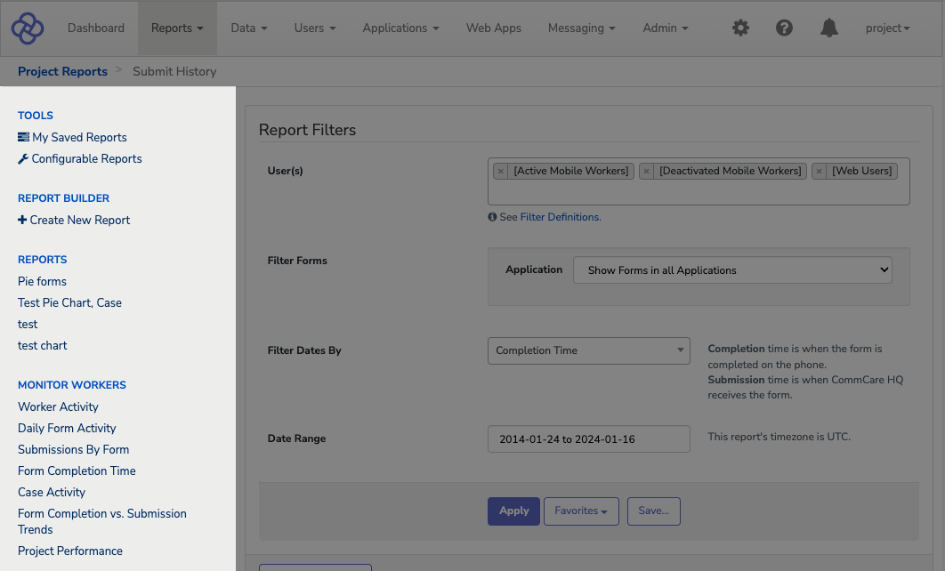
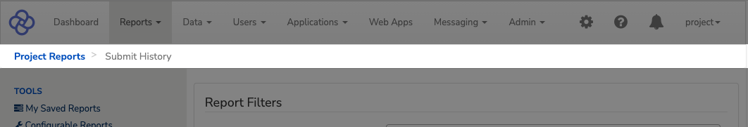
Top Navigation

The top navigation should always be visible to users. Individual tabs are defined in
tabclasses.py.
Which tab is highlighted depends on the url_prefix_formats defined for each tab. Which items
appear in a tab's dropdown is determined by dropdown_items.
Below is an example of how tabs are structured to create the navigation for the example views covered in the Views section of this styleguide.
from django.urls import reverse
from django.utils.translation import gettext_lazy, gettext as _

from memoized import memoized

from corehq.apps.styleguide.examples.bootstrap5.class_view import (
    ExampleCenteredPageView,
    ExampleParentSectionPageView,
    ExampleChildSectionPageView,
)
from corehq.tabs.uitab import UITab
from corehq.tabs.utils import dropdown_dict


class StyleguideExamplesTab(UITab):
    title = gettext_lazy("Style Guide")
    view = 'example_centered_page_b5'

    url_prefix_formats = ('/styleguide/b5/example/',)

    @property
    def _is_viewable(self):
        examples_url = reverse("example_views_b5")
        return self.request_path.startswith(examples_url)

    @property
    def dropdown_items(self):
        submenu_context = [
            dropdown_dict(_("Class-Based Examples"), is_header=True),
            dropdown_dict(
                _("Basic Page"),
                url=reverse(ExampleCenteredPageView.urlname),
            ),
            dropdown_dict(
                _("Section Page"),
                url=reverse(ExampleChildSectionPageView.urlname),
            ),
            dropdown_dict(_("Functional Examples"), is_header=True),
            dropdown_dict(
                _("Basic Page"),
                url=reverse("example_centered_page_functional_b5"),
            ),
            dropdown_dict(
                _("Section Page"),
                url=reverse("example_section_functional_b5"),
            ),
            self.divider,
            dropdown_dict(
                _("Style Guide"),
                url=reverse("styleguide_home_b5"),
            ),
        ]
        return submenu_context

    @property
    @memoized
    def sidebar_items(self):
        return [
            (_("Class-Based Views"), [
                {
                    'title': ExampleCenteredPageView.page_title,
                    'url': reverse(ExampleCenteredPageView.urlname),
                },
                {
                    'title': ExampleParentSectionPageView.page_title,
                    'url': reverse(ExampleParentSectionPageView.urlname),
                    "subpages": [
                        {
                            'title': ExampleChildSectionPageView.page_title,
                            'urlname': ExampleChildSectionPageView.urlname,
                        },
                    ],
                },
            ]),
            (_("Functional Views"), [
                {
                    'title': _("Centered Page Example"),
                    'url': reverse("example_centered_page_functional_b5"),
                },
                {
                    'title': _("Section Page Example"),
                    'url': reverse("example_parent_page_functional_b5"),
                    "subpages": [
                        {
                            'title': _("A Detail Page (Section Example)"),
                            'urlname': "example_section_functional_b5",
                        },
                    ],
                },
            ]),
        ]
Side Navigation
The side navigation appears almost everywhere. Major exceptions are the dashboard, which has no navigation, and app manager, which has a custom sidebar corresponding to the app's structure. Other pages should almost certainly have a sidebar.
The sidebar is also defined in
tabclasses.py,
controlled by the sidebar_items class methods.
Temporary sub-items that appear only when on a specific page, such as the "Create Form Data Export" item that
appears under the main "Export Form Data" item only when you're creating a new export, can be added using
the subpages property.
Dynamic item names, such as displaying the username when editing a web user, can be enabled by passing a
function to the menu item's title.
Breadcrumbs
Breadcrumbs are defined by the parent_pages class method in a class-based view.
Standard pages should have a breadcrumb for the top nav section (e.g., "Data"), for the left sidebar section
if there is one (e.g., "Edit Data"), and for the page itself. Multi-step workflows such as case import should
also be reflected in breadcrumbs. All items in the breadcrumbs should be links, except for the last
(the current page).
A few pages override the page_breadcrumbs block defined in the template:
hqwebapp/bootstrap5/base_section.html. This should only be done in exceptional circumstances.
Page Headers
A page header at the top of the page's main content helps the user stay oriented, and this is a good place to briefly introduce the user to the page and link to documentation.
This is an area where the technical implementation isn't well-standardized. When possible, make sure you
page_title attribute is defined if using a class-based view
(see this example)
or passed into the template context if using a functional view.
For a class-based view, you would then (ideally) set the page_title block this way:
{% block page_title %}
  {{ current_page.title }}
{% endblock %}
Otherwise, you can set the page header manually with the following bit of HTML at the beginning of
{% block page_content %}:
Mobile Workers
Mobile workers' activity and form submissions can be monitored in the
Reports section of this CommCare project space.
Read more about managing mobile workers on our
Help Site
.
<h1 class="h4">
  Mobile Workers
</h1>
<p>
  Mobile workers' activity and form submissions can be monitored in the
  Reports section of this CommCare project space.
  <br />
  Read more about managing mobile workers on our
  <a
    href="https://confluence.dimagi.com/display/commcarepublic/Create+and+Manage+CommCare+Mobile+Workers"
    target="_blank"
  >
    Help Site
  </a>.
</p>
In-page Navigation
If a page has multiple sections, you have a few options to visually separate them:
- Split into multiple pages.
-
Set each section up as a
tab(see docs). Please avoid usingpills for navigation as they look similar to select toggles used in forms. -
Enclose each section in a
card(see docs).
Tabs
Below is an example of sectioning a page with tabs. This is the most preferred method of sectioning a page in HQ.
<ul id="seasons" class="nav nav-tabs" role="tablist">
  <li class="nav-item" role="presentation">
    <button
      id="winter-tab"
      class="nav-link active"
      type="button"
      role="tab" aria-controls="winter-tab-pane" aria-selected="true"
      data-bs-toggle="tab"
      data-bs-target="#winter-tab-pane"
    >
      Winter
    </button>
  </li>
  <li class="nav-item" role="presentation">
    <button
      id="spring-tab"
      class="nav-link"
      type="button"
      role="tab" aria-controls="spring-tab-pane" aria-selected="false"
      data-bs-toggle="tab"
      data-bs-target="#spring-tab-pane"
    >
      Spring
    </button>
  </li>
  <li class="nav-item" role="presentation">
    <button
      id="summer-tab"
      class="nav-link"
      type="button"
      role="tab" aria-controls="summer-tab-pane" aria-selected="false"
      data-bs-toggle="tab"
      data-bs-target="#summer-tab-pane"
    >
      Summer
    </button>
  </li>
  <li class="nav-item" role="presentation">
    <button
      id="autumn-tab"
      class="nav-link"
      type="button"
      role="tab" aria-controls="autumn-tab-pane" aria-selected="false"
      data-bs-toggle="tab"
      data-bs-target="#autumn-tab-pane"
    >
      Autumn
    </button>
  </li>
</ul>

<div class="tab-content" id="tab-content-seasons">
  <div
    id="winter-tab-pane"
    class="tab-pane fade show active"
    role="tabpanel" aria-labelledby="winter-tab" tabindex="0"
  >
    December, January, February
  </div>
  <div
    id="spring-tab-pane"
    class="tab-pane fade"
    role="tabpanel" aria-labelledby="spring-tab" tabindex="0"
  >
    March, April, May
  </div>
  <div
    id="summer-tab-pane"
    class="tab-pane fade"
    role="tabpanel" aria-labelledby="summer-tab" tabindex="0"
  >
    June, July, August
  </div>
  <div
    id="autumn-tab-pane"
    class="tab-pane fade"
    role="tabpanel" aria-labelledby="autumn-tab" tabindex="0"
  >
    September, October, November
  </div>
</div>
Cards
Below is an example of sectioning a page with cards.
Winter
December, January, February
Spring
March, April, May
Summer
June, July, August
Autumn
September, October, November
<div class="card mb-3">
  <div class="card-body">
    <h5 class="card-title">Winter</h5>
    <p>
      December, January, February
    </p>
  </div>
</div>

<div class="card mb-3">
  <div class="card-body">
    <h5 class="card-title">Spring</h5>
    <p>
      March, April, May
    </p>
  </div>
</div>

<div class="card mb-3">
  <div class="card-body">
    <h5 class="card-title">Summer</h5>
    <p>
      June, July, August
    </p>
  </div>
</div>

<div class="card mb-3">
  <div class="card-body">
    <h5 class="card-title">Autumn</h5>
    <p>
      September, October, November
    </p>
  </div>
</div>